Start the conversation today. Fill out the form and take the first step toward measurable growth.
Thank you! Your submission has been received!
Oops! Something went wrong while submitting the form.
Close
How to Design a High-Converting Website in 2026: 5 Examples That Drive Real Results
Having a website isn't enough anymore. In 2026, every business needs a website that converts — one that doesn't just attract visitors but actively transforms them into leads, customers, and loyal advocates. The difference between a website that generates consistent revenue and one that quietly hemorrhages traffic comes down to design decisions most business owners never even think about.
This article breaks down exactly what makes a website convert, walks you through the essential design elements of high-converting websites, and showcases 5 real-world examples that demonstrate these principles in action. Whether you're building a new site from scratch or optimizing an existing one, this guide gives you a clear, actionable framework for creating a high-converting website in 2026 that does the one thing every business needs most — turn visitors into customers. Read on, because your website should be your hardest-working salesperson, not your most expensive brochure.
1. What Makes a Website Convert in the Digital World of 2026?
A converting website in 2026 is one that is strategically designed to guide users toward a specific action — whether that's booking a service, making a purchase, requesting a quote, or signing up for a free trial. Attractive web design alone won't convert visitors; what converts them is the combination of clear value propositions, intuitive navigation, fast loading times, trust signals, and compelling CTAs working together as a unified system.
The kind of web design that drives real results starts with a deep understanding of your target audience — their motivations, top concerns that people have before making a buying decision, and the objections they need resolved before they'll take action. Every design element on a high-converting website exists to serve one of three purposes: communicate value, build trust, or reduce friction in the conversion process. When those three pillars are in place, conversion rates improve dramatically and predictably.
According to Nielsen Norman Group's UX research, users form a first impression of a website within 50 milliseconds — meaning the visual design, layout, and clarity of your offer and why it matters must be immediately apparent before a single word is read. This is why high converting websites in 2026 invest as heavily in design strategy as they do in aesthetics — because how a site is structured is just as important as how it looks.
2. What Are the Core Design Elements Every High-Converting Website Must Have?
Every high-converting website is built on a set of non-negotiable design elements that work together to engage and convert visitors. The first is a clear value proposition — a concise, compelling statement that immediately communicates what your business does, who it serves, and why it's the best choice. Visitors should be able to find what they need quickly, without scrolling or searching. If your value proposition isn't clear within the first three seconds, most users will leave.
The second critical design element is intuitive navigation. Users should never feel lost or confused on a well-designed website — every page, menu, and link should guide users toward the conversion goal with minimal effort. Complex or cluttered navigation is one of the leading causes of high bounce rates and low conversion. Effective websites simplify the path from arrival to action, making it easy for users to find what they need and take the next step.
VisioneerIT's Web Design and Development services are built around these foundational conversion design principles — combining strategic layout, clear messaging, and user-centered architecture to create websites that don't just look great but are purpose-built to convert visitors into customers from the moment they land on the page.
3. How Do CTAs and CTA Buttons Drive Website Conversion?
CTAs are the engine of website conversion. Every converting website uses multiple strategically placed calls to action that direct users toward the next logical step in the conversion process — whether that's scheduling a consultation, requesting a demo, or starting a free trial. Effective CTAs guide users through the site with clarity and urgency, removing ambiguity about what the visitor should do next.
CTA buttons should be visually prominent, action-oriented, and specific about the value the visitor will receive. "Get My Free Quote" outperforms "Submit" because it frames the action as a benefit, not a task. The language, color, size, and placement of CTA buttons all significantly affect conversion rate — and small changes to any of these variables can produce meaningful lifts in how many visitors take action. Effective CTAs guide users toward conversion by meeting them with the right message at the right moment in their browsing journey.
Websites that convert use CTAs throughout the page — not just at the bottom. A hero section CTA captures high-intent visitors immediately; mid-page CTAs re-engage users who are still evaluating; end-of-page CTAs provide a final, clear invitation to act. Unbounce's Conversion Benchmark Report consistently shows that pages with multiple, well-placed CTAs outperform single-CTA pages in nearly every industry — making CTA optimization one of the highest-return investments in web design.
4. Why Are Value Propositions and Trust Signals So Critical to Converting Visitors?
Your value propositions and trust signals are the two most persuasive forces on any high-converting website. Value propositions communicate the specific, tangible benefits your product or service delivers — and they need to be front and center, not buried in body copy. A clear value proposition immediately answers the visitor's most important question: "Why should I choose this business over everyone else?"
Trust signals reduce the psychological friction that prevents visitors into customers from completing the conversion. In 2026, consumers are more skeptical and more informed than ever — they need evidence before they act. Trust signals include customer testimonials, verified reviews, case studies, certifications, security badges, media mentions, and partner logos. Every one of these elements tells the visitor that other people have trusted this business and been rewarded for it — which makes them far more likely to convert.
Dentist practices are a perfect example of a business where trust signals make or break the conversion. A dental website that prominently features patient testimonials, before-and-after photos, and credentials converts dramatically better than one that simply lists services. When a prospective patient sees social proof that others have had a great experience, the trust barrier drops — and conversion rates rise correspondingly.
5. What Role Does the Hero Section Play in a High-Converting Website Design?
The hero section — the full-width area at the very top of your homepage or landing page — is the single most important piece of real estate on your website. It's the first thing every visitor sees, and it sets the tone for everything that follows. A well-designed hero section communicates your clear value proposition instantly, includes a strong CTA, and uses visual design to create an immediate emotional connection with your target audience.
High-converting websites use the hero section to showcase what they do, who they serve, and what action visitors should take — all within a few seconds. The design should be clean, the headline powerful, and the CTA prominent. Background imagery, video, or illustration should reinforce the message rather than distract from it. When the hero section works, it captures high-intent visitors before they even begin to scroll — dramatically improving the conversion rate of every page it appears on.
Trust and estate planning firms benefit enormously from a well-crafted hero section that communicates authority, compassion, and clarity immediately. Visitors landing on these pages are often in emotionally sensitive situations and need instant reassurance that they've found the right firm. A hero section that speaks directly to those concerns — and immediately offers a clear next step — is what separates a website that converts from one that won't convert even when the traffic is there.
6. How Does Mobile Responsiveness Affect Conversion Rate in 2026?
In 2026, the majority of website traffic coming from mobile devices makes mobile responsiveness not just a best practice but a baseline requirement for any converting website. A site that looks beautiful on desktop but breaks on a smartphone loses a massive portion of its potential conversions before the visitor even has a chance to engage with the content or CTAs.
Responsive design ensures that your website automatically adapts its layout, typography, and CTA buttons to deliver an optimal experience on every screen size. Mobile users expect fast loading, easy navigation, and accessible CTAs — and when any of these elements are compromised, they leave. Mobile responsiveness directly affects both SEO rankings and conversion rates, making it a dual-impact design priority that no business can afford to ignore.
According to Google's Mobile-First Indexing guidelines, Google now predominantly uses the mobile version of a website for indexing and ranking — meaning a poor mobile experience doesn't just hurt your conversion rate, it actively suppresses your search visibility. In 2026, a truly high-converting website in any industry must be designed mobile-first, not mobile-adapted as an afterthought.
7. How Do Loading Times and Website Speed Directly Impact Conversions?
Page load speed is one of the most direct and measurable factors affecting website conversion. Research consistently shows that every additional second of loading time reduces conversion rate significantly — with fast loading pages converting at nearly double the rate of slow ones. In a digital world where attention is scarce and options are abundant, users simply won't wait for a slow website.
Loading times affect not just conversion but also user experience, SEO rankings, and overall brand perception. A business that invests in premium branding but neglects website speed sends a contradictory signal to visitors — the content promises quality, but the experience delivers frustration. Optimizing images, minimizing code, leveraging browser caching, and using content delivery networks (CDNs) are all essential technical steps toward a fast-loading, high-converting website.
VisioneerIT's Lead Generation solutions are directly tied to website performance — because no lead generation strategy can succeed if the website it drives traffic to is too slow to hold visitors' attention. Tools like Google Analytics and Google PageSpeed Insights provide the data-driven insights needed to identify speed bottlenecks and prioritize the fixes that will have the greatest impact on conversion rates.
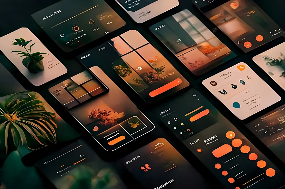
8. What Are 5 Real-World Examples of High-Converting Website Design Elements?
Real-world examples of high-converting websites reveal consistent design patterns that can be adapted across industries and business sizes. Here are five website examples that demonstrate conversion-focused design in action:
Shopify uses a bold, benefit-driven hero section with a single, prominent CTA and a free trial offer that removes the financial barrier to entry — dramatically reducing friction and increasing sign-up conversion rates across millions of visitors. Airbnb showcases its value proposition through immediate personalization, allowing users to tailor their search experience from the first interaction — creating a tailored experience that increases engagement and conversion simultaneously. HubSpot uses extensive social proof throughout its website — including customer testimonials, case studies, and data-backed results — to build trust at every stage of the buyer journey. Basecamp employs a long-form landing page that systematically addresses every objection a potential customer might have, using conversational copy and trust signals to guide visitors toward a single clear CTA. Squarespace leads with visually stunning design templates that immediately communicate the quality of the product — demonstrating the service through the experience of the website itself.
Each of these high converting websites shares a common thread: they are built around an intimate understanding of their target audience, and every design decision — from layout to copy to CTA placement — is in service of converting that specific audience. These best examples prove that conversion optimization isn't about manipulation; it's about removing every possible barrier between a motivated visitor and the action they already want to take.
9. How Does Branding Contribute to a Converting Website?
Branding and website conversion are more deeply connected than most businesses realize. A website that lacks a consistent, professional brand identity loses conversion opportunities because it fails to build trust at the subconscious level. Visitors judge the credibility of a business largely by the visual quality of its web presence — inconsistent fonts, off-brand colors, or amateur photography signal a lack of professionalism that undermines confidence and suppresses conversion.
Strong branding on a website creates a cohesive, emotionally resonant experience that makes visitors feel they've found a business they can trust. Every design element — color palette, typography, imagery style, tone of voice — should reinforce the same brand promise and speak directly to the values and expectations of the target audience. When branding and conversion design work together, the website becomes a seamless extension of the brand that naturally guides visitors toward taking action.
VisioneerIT's Branding Solutions are designed to create this kind of cohesive, conversion-supporting brand identity — ensuring that when visitors land on your website, every visual and verbal element works in concert to communicate value, build trust, and motivate action. A small investment in professional branding consistently yields outsized returns in website conversion rates and overall business credibility.
10. How Do You Continuously Optimize a Website That Converts for Long-Term Results?
Designing a high-converting website is not a one-time event — it's an ongoing optimization process that uses data to continuously improve performance over time. Tools like Google Analytics provide insights into how visitors interact with your website, where they drop off, which CTAs they engage with, and which pages produce the highest conversion rates. This behavioral data is the foundation of any serious website optimization strategy.
A/B testing is the most reliable method for systematically improving conversion rate over time. By testing different headlines, CTA button colors, landing page layouts, and testimonial placements — and measuring the impact on conversion with real user data — businesses can make data-driven design decisions that consistently move the needle. Website optimization is not guesswork; it's a disciplined, iterative process of measuring, testing, and refining based on what the data actually shows.
Med Spas and wellness clinics are an excellent example of a business category where ongoing website optimization delivers compounding returns. By continuously refining service page copy, testing new CTAs for booking appointments, and optimizing landing page layouts based on real visitor behavior, med spas can meaningfully increase their new client acquisition rate without increasing their advertising spend — making website optimization one of the highest-ROI investments in their entire digital marketing strategy.
Key Takeaways to Remember
A website that converts in 2026 is built on clear value propositions, intuitive navigation, fast loading times, strong trust signals, and strategically placed CTAs — all working together.
The hero section is your most valuable conversion real estate — it must communicate your offer clearly and include a compelling CTA within the first few seconds of landing.
CTAs and CTA buttons must be specific, benefit-driven, and placed at multiple points throughout the page to capture visitors at every stage of engagement.
Trust signals — including customer testimonials, reviews, and case studies — are essential for reducing friction and converting skeptical visitors into buyers.
Mobile responsiveness is non-negotiable in 2026 — a poor mobile experience kills both conversion rates and SEO rankings simultaneously.
Loading times directly impact conversion rate — every additional second of page load reduces the likelihood that a visitor will take action.
Branding and design consistency build subconscious trust — professional, cohesive visual identity significantly improves conversion across every page.
Real-world examples from Shopify, Airbnb, HubSpot, Basecamp, and Squarespace show that the best converting websites are built around deep audience understanding and relentless friction reduction.
Website optimization is an ongoing process — use tools like Google Analytics and A/B testing to continuously refine your design based on real user behavior.
Design a website that converts by treating it as your most important salesperson — every element should exist to communicate value, build trust, or guide users toward the action that grows your business.